Lots of frontend developers are getting excited by container queries finally starting to get implemented by browsers. However, some of these features can already be achieved with CSS clamp.
What is Clamp?
Clamp is a CSS function that selects a value between an upper and lower value.
The Clamp function takes in three parameters. The first is the minimum value you want, the second is the preferred value and the third is the maximum value. The preferred value should be a relative unit like % or vw, so that the value changes.
.mr-clamp {
    width: clamp(250px, 75%, 1080px);
}
In the above example, we have set a minimum value of 250px, a preferred value of 50% and a maximum value of 1080px. This means that the width will be 250px until the computed value of 75% is greater than 250px, up until a maximum computed value of 1080px.
Practical uses of Clamp
Setting font sizes
Clamp can be used to set responsive font sizes without the need for media queries. This is useful when you want a smaller font size on mobile and a larger font size for larger desktops with a fluid font size in between.
h1 {
    font-size: clamp(1.75rem, 4vw, 3rem);
}
Below is a working example. Resize your browser to see the font size adjustments. You might need to open in Codepen to properly see this.
Setting container widths
Clamp can be used nicely to set widths of containers without the need for media queries. This could be useful for setting the width on container elements like a website wrapper.
.container {
    width: clamp(250px, 75%, 1080px);
    margin: 0 auto;
}
Below is a working example. Resize your browser to see the width of the container being set.
Response padding
Clamp can be useful to provide responsive padding where in the past you might have used multiple media queries.
.container {
    padding: 1.5rem clamp(1rem, 10%, 5rem);
}
Below is a working example. Resize your browser to see the padding changing.
What is the browser support for CSS Clamp?
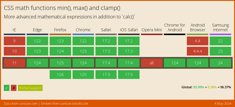
The browser support for CSS clamp is really good with almost all modern browsers supporting it. The main browser that doesn’t support it is IE11 and if you are lucky enough not to support IE anymore, then you are good to go. Even if you do still need to support IE, in a lot of cases you could set sensible fallbacks.
So with good browser support and lots of practical uses, I would recommend giving CSS clamp a go!


